Michael Porter introduced the idea of an activity system map in 1985 as a way to strengthen business strategy.
It serves as a visual tool that shows how different activities connect, support each other, and build on a company’s core strengths.
By mapping these links, organizations can see how their efforts fit together, making it easier to stay focused on long-term goals and create a stronger competitive position.
The Primary Value of an Activity System Map
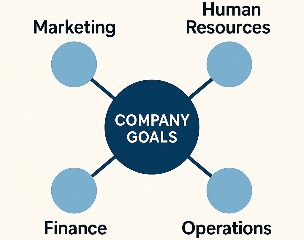
An activity system map gives clarity to how different parts of an organization connect. Instead of viewing activities in isolation, the map highlights the full web of relationships.
Managers can see how each function, policy, and process contributes to the company’s broader strategy. That perspective turns scattered efforts into a coordinated system.
When leaders apply this approach, they can identify strengths, notice weak links, and align every decision with long-term objectives. The activity system map serves both as a guide and a tool for analysis, helping organizations shape their future direction with purpose.
How It Strengthens Strategic Thinking
The map reshapes how managers think about strategy. It directs attention to activities as part of a system rather than isolated actions.
A training program provides a clear example. It builds skills, supports company culture, improves customer service, and creates consistency across departments.
When managers view activities through this lens, they can measure the broader effect of their decisions. That view helps them focus on actions that strengthen the company’s position and avoid choices that scatter resources without benefit.
Key Benefits of Using an Activity System Map
- Better Decision-Making: Managers can evaluate if a new opportunity fits within the current system or creates conflict.
- Improved Alignment: Teams can clearly see how their work supports company goals.
- Competitive Strength: The network of activities makes it more difficult for competitors to copy the full strategy.
- Dual Role: It serves both as a diagnostic tool and a forward-looking guide for shaping future plans.
Linking to Other Strategic Concepts
The activity system map connects well with other models. A good example is the flywheel concept in business. The flywheel focuses on momentum and shows how small, consistent actions build lasting energy over time.
Together, the activity system map and the flywheel highlight an important idea. Strategy depends on a system of connected activities that support one another and drive the organization forward.
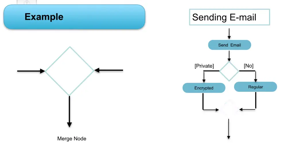
How to Create an Activity System Map

An activity system map takes shape through a clear process. Each stage turns raw information into a structured view of how activities support the organization’s strengths.
The goal is to reveal the system behind the strategy and make connections visible.
1. Collect the Foundation
Begin with the documents that define the organization. Financial statements, mission statements, strategy reports, and internal reviews provide the foundation.
Sources like this reveal priorities, resource use, and the most important activities in place.
2. Identify Strategic Activities
Analyze the information to find the activities and policies that reinforce the organization’s core competencies. Place them into broad themes such as innovation, efficiency, or customer focus.
Each theme acts as an anchor in the system map.
3. Build the Visual Map
Convert the analysis into a diagram. Use mapping tools to link activities with the themes and highlight how they support one another.
The map should clearly display how every action connects to the overall strategy.
4. Confirm Accuracy with Teams
Share the draft with team members across departments. Their input ensures the map reflects real operations and not only leadership assumptions.
Collaboration at this stage also creates shared commitment to the strategy.
What Makes an Activity System Map Effective
An effective activity system map does not simply show activities in a loose arrangement. It highlights the strength of a strategy by demonstrating how tightly connected the activities are to one another and to the company’s core competencies.
A dense network of links signals clarity of direction and a system that reinforces itself.
Strong Connections Show Strategic Fit
When a map is full of links between activities, managers can see that the organization has an integrated approach. Each action supports another, which creates a strong overall structure.
This reduces duplication, strengthens execution, and ensures every part of the business contributes to long-term goals.
Weak Connections Reveal Gaps
A map with very few connections tells a different story. Sparse links can signal misalignment, wasted resources, or an unclear direction.
By analyzing where connections are missing, leaders can identify areas that need adjustment. That view prevents blind spots and provides a starting point for improvement.
A Tool for Generating New Ideas
The value of the map goes beyond diagnosis. It also supports creativity in strategy. Reviewing the diagram can uncover new ways to link activities, improve existing ones, or develop features and products that add competitive strength.
The map encourages managers to think in terms of systems instead of single actions.
Agility Through Continuous Review
An effective map is not static. By returning to the diagram as conditions change, organizations can remain adaptable. Market shifts, new technologies, and evolving customer needs demand updates.
It helps leaders adjust while keeping the overall system intact and aligned with long-term goals.
Practical Applications

Activity system maps have a wide range of practical applications in strategic planning and operational management.
They are particularly useful for:
- Decision Making: Activity maps help organizations make incremental decisions about new opportunities. By visualizing how a new idea fits into the existing strategy, managers can assess its potential impact and avoid undermining other aspects of the business.
- Communication: These maps are valuable communication tools that illustrate how every function and policy contributes to the organization’s strategy. They can be used to cascade key performance indicators (KPIs) throughout the organization, ensuring alignment and accountability at all levels.
- Identifying Misfits: Activity maps highlight areas where current activities may undermine the organization’s strategic goals. Identifying these misfits allows organizations to make necessary adjustments and ensure that all activities support the overall strategy.
- Outsourcing Decisions: By defining the boundary of the organization’s core activities, activity maps help managers make informed decisions about outsourcing. Activities that are not central to the organization’s competitive advantage can be outsourced to enhance cost-effectiveness without risking strategic coherence.
- New Ventures and Acquisitions: Activity maps are essential for evaluating the strategic fit of new ventures or acquisitions. If the activity maps of two businesses are significantly different, combining them could create trade-offs and inefficiencies. Keeping them separate may be more advantageous, even if it increases costs.
Ryanair as an Example of a Low-Cost Strategy
Ryanair offers a clear view of how an activity system map strengthens a business model. The airline is known for keeping fares lower than most competitors, and the system of activities behind that promise shows why the approach works.
The entire strategy centers on cost leadership. The company prioritizes efficiency over luxury and designs its operations around what customers value most: cheap and reliable travel.
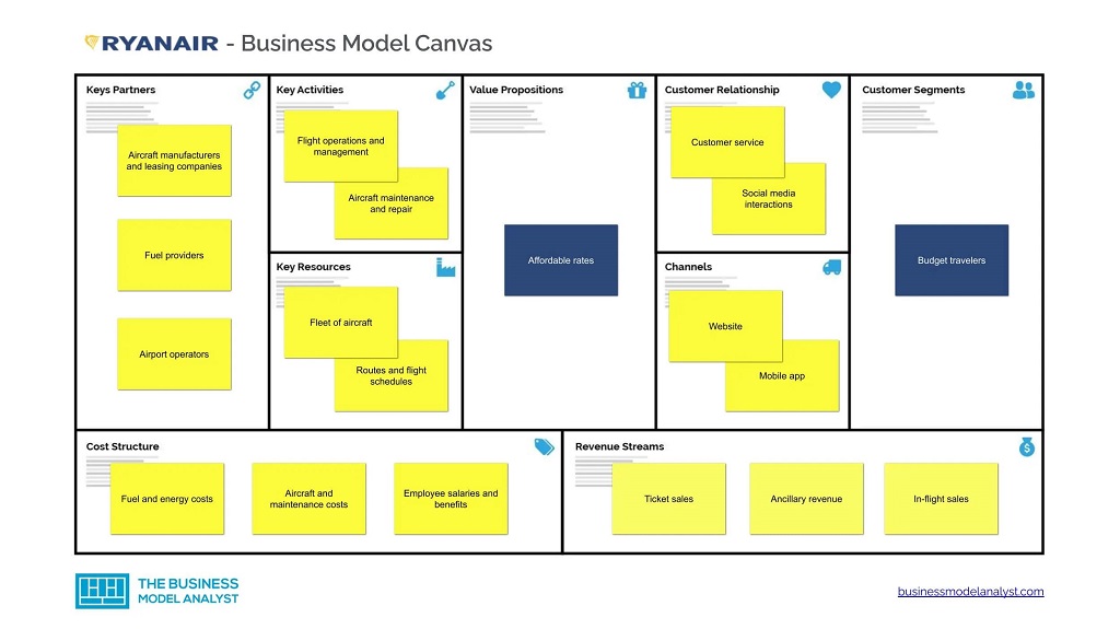
Activities that Support the Strategy
- Single aircraft model: Using only Boeing 737 planes reduces training needs, lowers maintenance costs, and simplifies operations.
- Secondary airports: Flying to smaller airports cuts landing fees, avoids heavy traffic, and speeds up turnaround times.
- Basic service model: Optional extras such as food, baggage, or seat selection generate revenue while keeping base fares low.
- Fast turnaround: Ground operations are streamlined, allowing planes to fly more routes each day and spread costs across more passengers.
The strength of the system lies in the links. The choice of one aircraft type supports quick turnarounds. Secondary airports align with the low-cost model by reducing fees and delays. Optional extras add revenue without undermining the promise of low fares. Each part reinforces the others, making the system difficult for rivals to copy in isolation.
Adobe Analytics Activity Map
Adobe Analytics offers a feature called Activity Map that shows how visitors interact with websites and mobile apps. It provides direct visibility into where people click, where they spend time, and how they move through a page.
The goal is simple: give teams a clear view of what users actually do, so design and content decisions can be based on evidence.
How It Shows Behavior
Activity Map places visual markers on a page to reveal where users engage.
Clicks, scrolls, and hovers are tracked, then displayed in a format that highlights strong and weak areas.
Instead of digging through spreadsheets, managers can see real behavior on top of the page itself.
Heat Map Insights
Heat maps add color to interaction data. Areas that attract attention appear warmer, while areas with little activity stay cooler. This makes it easy to see which buttons, links, or sections drive the most value.
Teams use that knowledge to refine layout, adjust calls to action, and improve user flow.
Element-Level Reporting
Overlay reports break down engagement by specific items on a page. Each link, button, or feature shows exact numbers, which helps when comparing designs or testing new features.
Such a high level of details that guide small changes that often have a big impact.
Understanding Different Audiences
The feature also allows segmentation. A team can view how mobile users behave compared to desktop visitors, or how traffic from one campaign differs from another.
Practical Use
Activity Map is widely used in conversion optimization, A/B testing, and mobile app design. It highlights underperforming elements, supports navigation improvements, and helps measure the effect of design changes.
The benefit is clear: teams can act on real behavior instead of assumptions.
Conclusion
An activity system map gives leaders a way to see how different parts of a business connect and support each other. It turns scattered actions into a system, making strategy more visible and easier to manage. By mapping the links between activities and core strengths, organizations can spot gaps, strengthen alignment, and focus on choices that build long-term advantage.
The value of this tool extends beyond analysis. It supports communication across teams, guides investment decisions, and helps identify new opportunities for growth.
When combined with digital tools like Adobe Analytics Activity Map, the framework becomes even stronger, offering insight into customer behavior and interaction patterns that shape modern strategy.
A well-designed map helps a company stay clear in its direction, consistent in its execution, and flexible enough to respond to change. In that way, it remains one of the most practical tools for building and maintaining a competitive edge.